DITO Masterpiece || A Lesson in Color
Hello Friends!
I'm excited to share with you a technique I recently learned using colored pencils. I was drawing a picture of a horse from Jac's blog (check out her blog if you haven't yet!) in colored pencil. The problemo was, I left my big case of colored pencils in storage and only had with me a select few colors (I've been missing my case SO MUCH!!). I realized that I had a lighter, reddish brown, but had failed to add a dark brown to my small bundle...annnd, that's not very exciting when you've decided to draw a dark brown horse *insert facepalm.* So I had to pretend I was a homesteader living in the wilds of the great Midwest and create my own dark brown...okay, not really; I'm not that dramatic. But I did have to figure out how to make my own dark brown.

Thankfully, I had taken a workshop on oil painting last summer and the instructor taught me a valuable lesson, which I posted a bit about here. He taught me how to mix a color palette. Let me confess, I did Google how to make brown with colored pencil first before my unofficial color theory knowledge kicked in and I added to what I read online.

Here are the basics: Look at the above color wheel. This is a wheel that includes primary and secondary colors. Primary colors are red, yellow, and blue. These are colors that cannot be created through a combination of any other colors - they are the base-est (yes, made-up word) you can get, that one particle every philosopher and scientist is looking for that supposedly sprouted the entire universe (NOT. We can talk about that later). The secondary colors are the next level of base-ness. They are made through a simple combination of the primary colors they are wedged between. For example, the green color on the right side of the wheel is merely a swatch of the blue that is below it, layered on top of a swatch of the yellow above. The secondary colors are born out of the primary colors.
Now, colors that are opposite from each other on the color wheel are called complimentary colors. When placed side by side, complimentary colors...well, compliment each other :D But, if complimentary colors are layered on top of each other, they become brown - or at least give the illusion of being brown in the case of colored pencils. So:

Green is the compliment of red...

Orange is the compliment of blue...

And purple is the compliment of yellow.

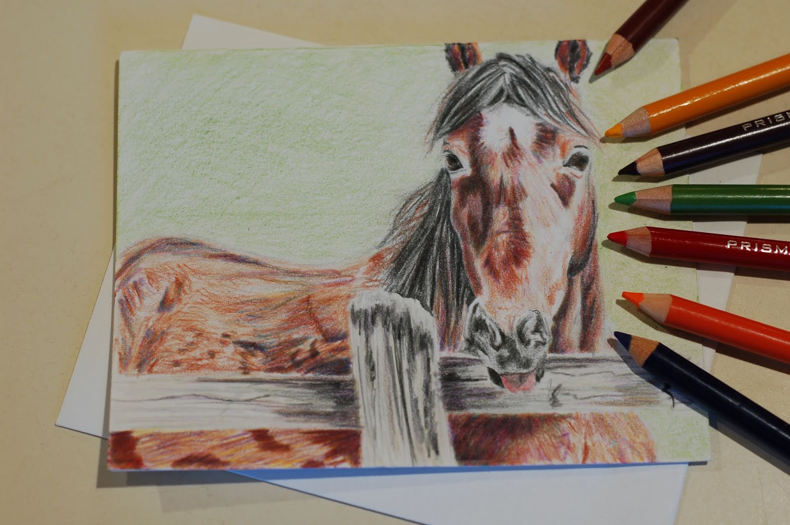
Now, if you ever happen to find yourself trying to survive in the wilds of the Midwest - or whatever wilds you find yourself in, you will know how to make dark brown out of a rainbow array of colored pencils - an essential survival skill, I must say. Isn't it cool how God made color that way?
Have you ever found yourself creating a certain color by combining a posse of other, unrelated colors? Let me know in the comments below!


Comments
Post a Comment
Have thoughts or questions about what you read here? Let me know in the comments below! I only ask that you please keep your comments clean and edifying according to the following verse:
"Let no corrupt communication proceed from your mouth, but that which is good for the use of edifying, that it may minister grace unto the hearers. " Ephesians 4:29